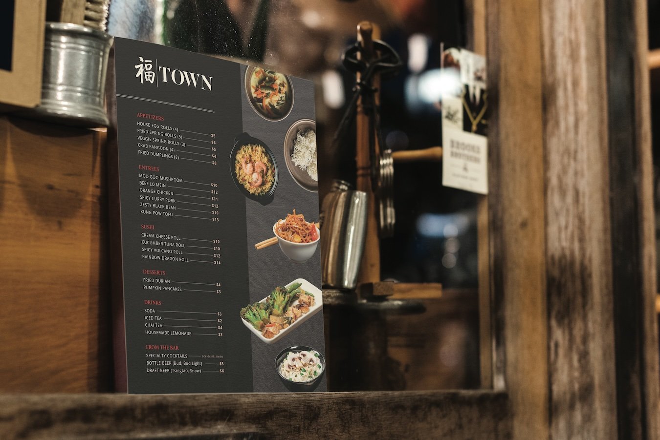
Town Restaurant print materials
The client needed branded materials for their Asian cuisine restaurant. Assets like the logo, fonts, and colors were provided, and the rest was up to me.
menu design
trifold brochure design
table tent design
Key Takeaways
Shining Cut-Out Graphics
The use of cut-out graphics works so well in the menu and brochure designs to add depth and elegance to the overall look and feel while still leaving room for the other important elements and information.
Vibrant Colors
Imagery is so important with industries like food - the featured food should look as realistic and delicious as possible. That said, I added saturation to many of the graphics used in these pieces to help enhance the experience for the intended audience.
Keeping Things Consistent
Going back to the cut-out graphics, this design worked beautifully for both the brochure and menu given the intention of those pieces was similar. All designs make use of the textured background and black overlays while blending elements of each piece together in a way that makes sense and guides the eye in the desired direction.
Continue exploring print projects…


